As I’ve learned watching through 831 episodes of Power Rangers for two-thirds of my life, a Ranger is only as good as their suit. A suit design can make or break a series through first impressions, and bad designs have indeed turned fans away from some seasons of the show in the past.
I don’t know much about fashion, or have any finalized way of judging these suits so you’ll probably read a lot of the same complaints, but with my Power Rangers expertise, I’ve been able to parse out which ones were the coolest and which were the least powerful.

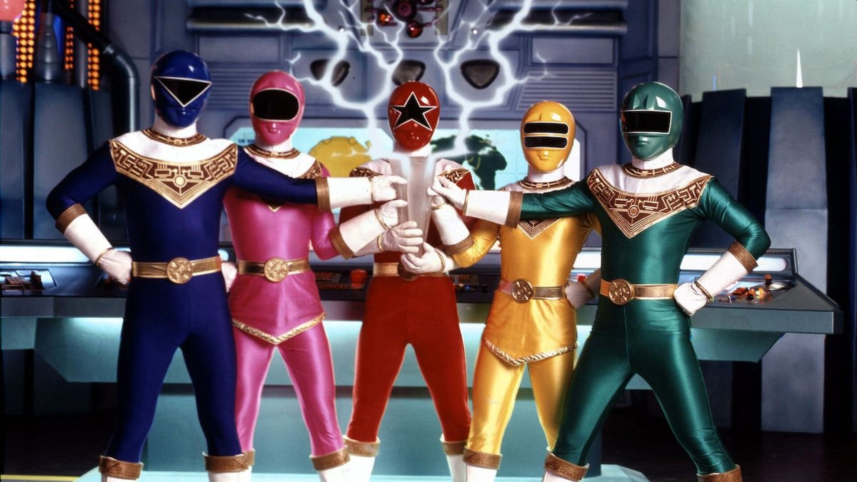
21. Power Rangers Megaforce
Originally touted as an anniversary season of the series, Megaforce has plenty of problems. Least/Most of which is the costume design. While these suits have some good ideas such as the helmet’s mouthpiece reminiscent of Mighty Morphin‘ (which must’ve been a happy little coincidence for Saban), and I do like some of the gold highlights, everything else is a mess. The suit’s way too busy to actually work. I’m sure the outfits make sense in the Japanese original, but why do their chest emblems have different designs? Why do all of their pants ride so high up as to give them uncomfortable looking front wedgies? It’s like a weird military outfit without any of the context. Just goofy and bulky.

20. Power Rangers Operation Overdrive
Like Megaforce, Operation Overdrive‘s suits are far too busy. There’s some simplicity in the helmets (at least they have visors the suit actors can actually see out of), but there’s so much to unpack at first glance. The motif this season was world adventuring (hence the compass insignia), but the helmets all reflect their vehicle zords so it gives them headlights like Turbo‘s ridiculous ones. Then add in the chrome shoulder plates, belts, and cufflinks and it’s way too much. Not to mention the Silver Ranger’s awful orange stripe and lavender shoulders which makes the entire team look worse each time he’s near.

19. Power Rangers Turbo
Speaking of Turbo, their helmets are the worst in the series. Replicating their vehicles gives them chrome and headlights coupled with tail lights (?) on their belts. The rest of the suit is fine, but you just can’t take those helmets seriously. It was fine in a Japanese series parodying other Sentai shows but didn’t exactly work for a serious Power Rangers drama which included the team getting baked into a giant pizza.

18. Power Rangers RPM
RPM was a fantastic send-off for the Disney owned seasons, but showrunners wanted their idea for a show, a post-apocalyptic thriller to somehow mesh with one of the goofier Japanese seasons, Engine Sentai Go-Onger. Fortunately, it mostly works as there’s a story reason behind the suit designs, but it always rubbed me a wrong way that these didn’t reflect the story. They’re not the worst suits, but they’re by far from the best. Combining animals, cars, and everything else into their helmets, once again there’s a lot going on. Doesn’t help that the suits look baggy too without a true separation of tops and bottoms. The only thing which kind of works is the animal/number insignia since it does resemble flair soldiers are known to give their uniforms for morale. Otherwise, c’mon it’s a mess.

17. Power Rangers Dino Charge
I like a lot of the choices made with the Dino Charge suits, especially the slick helmets (which go full-visor when they’re in the Megazord), but a major complaint I keep using once again rears its ugly head. There’s just so much going on with these suits. It’s indicative of the series as a whole (so many Rangers, zords, motifs), but just doesn’t come together like the show does. A slick helmet juxtaposed with a bright tooth pattern, monochromatic pants and shoes, and grey-scaled sleeves? It aaaalmost works, but then you’ve got the random single shoulder pad and lose all sense of symmetry.

16. Mighty Morphin Alien Rangers
I may appreciate simplicity in design, but there’s such a thing as too simplistic. There’s a reason this entire season of Ninja Sentai Kakuranger was skipped over in favor of using the Mighty Morphin’ suits for a third season. The design was used creatively (tweaking the “ninja” motif into an “alien” one), but that’s only because of its stark contrast to the original suits. These are neat and uniform (more so than any other season). but they were too bare bones to work on their own. Which is why they’re only around for a short time.
15. Power Rangers Zeo
Zeo was a transition season for the series in a number of ways. New powers, new villains, new Command Center, colors were shuffled around (Tommy became the Red Ranger, Jason eventually became Gold), and the show started distancing itself from its original motifs. Gone are the spiritual animal and dinosaur powers, and replaced with full-on magic crystal powers. While I like the gold trim, I’ve never liked the suits overall. They seemed like a downgrade from the originals due to a general lack of white and the Yellow Ranger’s loss of vision. But I did appreciate the shift away from the molded mouths. Instead of a grey stand out, they’re blended into the helmet. I also don’t think I liked how everyone looked chunkier? I don’t know, old school aesthetic I guess.

14. Power Rangers Jungle Fury
Now these suits would crack the top ten if the Red and Blue Rangers had the same skirt as Yellow does. Skirts have always been a major problem for this series, and I don’t really have the time or space to go into why they’re a problem here, but Yellow’s actually works the best. Like Purple and White, her suit most reflects a fighting gi which greatly suited this season’s kung-fu movie theme. The White Rhino Ranger has my favorite design overall since he just looks like a kick-ass karate dude. That’s never happened in the series before, and it still has yet to happen again. More blatant kick-ass karate folks, please.

13. Power Rangers Lost Galaxy
I feel like Lost Galaxy‘s suits were so middle-of-the-road, it deserved to be in the middle-of-the-list. I was always a huge fan of the helmet design but hated the Charlie Brown stripes on their chest. This was another season in which the Rangers looked especially bulky, and they only looked worse following In Space’s slimmed down and sleek design. I wish I had more to say, but honestly, these suits are boring though they don’t look like they would be.

12. Power Rangers Dino Thunder
Dino Thunder was Disney’s attempt to wrangle in old fans of the series. Bringing Tommy in as a dope looking Black Ranger (not pictured here since I couldn’t find one with a good enough quality) and an “evil” White Ranger with an also great design, the main trio was almost there. It’s a simple aesthetic with the dino theme barely peeking through in the helmet, but from the neck down it’s a little much. I’m a huge fan of the footprint insignia in the center, but these suits almost have too much white. The diamonds running down their arms and legs may serve a story and power purpose, but that doesn’t mean I don’t have to like them. But as we’re getting closer to the top ten, I’m splitting hairs.

11. Power Rangers Ninja Steel
It’s only six episodes in, but I’ve been impressed by what Ninja Steel has offered thus far. Notably, the suits are fantastic. You’ve got the ninja sensibilities (done much better seasons before, but you’ll see that soon), but since these ninjas don’t really care about anything ninja-y the bold design on their sashes gives their insignia a bit of pop. It’s simplicity masking outlandishness working especially well with the White Ranger and her pink outline.

10. Power Rangers Lightspeed Rescue
Lightspeed Rescue was the first season of the series to have its team be a military force and it’s look reflected that pretty damn well. A simple design shared between the entire team with only differentiating factors being visor and color. The white balance here works, unlike Dino Thunder, because it has a clear stopping point. It along with the crosses on their helmets reflect the rescue theme of the season and overall looks good in motion too. This was a team where the difference in appearance wasn’t too necessary, yet felt like it was included to keep up the morale of the force like RPM.

9. Power Rangers Mystic Force
Capes are cool, so I can’t believe they’ve only been part of one season. A lot of things I thought would bother me at first glance actually works well in motion. There’s a nice white/color balance as it’s only relegated to the capes (and the women’s white bottoms make them look like they’re wearing tunics, which is a plus), the giant black and gold “M” is a great design choice that’s totally not overpowering or super noticeable unless you really stare at it, and although the visors seem tough to see through there’s an overall “grand” feeling in the design. It’s kind of like what Megaforce wanted to accomplish but grandly failed at.

8. Power Rangers Super Megaforce
Speaking of Megaforce, the second half of the series had one of the coolest costumes ever. I’m a big fan of this pirate look since it’s so unique (with only small differences in visor design among them), and these looked really clean in motion. In fact, they even popped their collars during the Ranger roll-call and it was about as goofy as you’d expect. In a good way. However, since the pirate look was never capitalized on (or explained, really) these awesome suits were wasted. Not to mention that these are only powered-up versions of the Megaforce suits and not a full team of their own. If this look had been handled better, you could be damn sure it would’ve been in the top five.

7. Power Rangers Ninja Storm
Although the Alien Rangers were technically ninjas, the first foray into a ninja ranger season was an impressive one. The first full season of the series to use a teal color for the Blue Ranger, a simple but expressive helmet design and darker colors for the two Thunder Rangers really left an impression on me. The visors also opened in a cool way; only revealing part of the face when they were speaking to each other. Since we’re getting into the nitty-gritty of the list, I will say these suits were eeked out by some that did a liiiittle bit more. Especially considering how all of this awesome simplicity was tossed out the window in favor of the Green Samurai Ranger’s obnoxious look.

6. Power Rangers Wild Force
Wild Force is the only season of the series so far that comes closest to the first season in suit design. The gaudy, but slightly subdued helmets are a natural evolution of the dino helmets, except here more teeth come down over the visors. The shark helmet is a standout, and I’m very fond of the White Ranger’s pink stripe highlighting her skirt. The one thing I’m not a fan of, however, is the huge gold strap on their chests. It’s a little much coupled with the insignia, and its asymmetrical placement definitely throws off the look. The belt buckle also takes up too much real estate and makes the waist seem unnecessarily heavy.

5. Power Rangers S.P.D.
S.P.D. was one of my favorite seasons for a number of reasons, and a great deal of it had to do with the look. While the visors are a bit too stretched across the helmet for my liking, everything from the neck down absolutely works. The asymmetrical design actually makes sense here (with one side reserved for their police badges and labels and whatnot) and their number leading to an all-black arm is so damn cool looking. The series has never made this kind of design choice before, so it really sticks out from the other seasons. It’s uniform, yet flashy.

4. Power Rangers Time Force
Time Force was another favorite of mine. Combining the simplicity I love, with the gaudy look of the original, the Time Force suits were a great uniform for the team. I’m not sure how any of the suit actors actually saw things out of the colored visors, but I didn’t care. These suits are great and the visors (meant to resemble clock hands) are an inspired choice. The only thing I never really liked was the Quantum Ranger’s closely resembling Red, but it made sense story-wise (a company developed their own Ranger tech based on Time Force). I think limited the white to the should up is what makes it work overall. It was fluid to see in action.

3. Power Rangers Samurai
It’s a shame such a great suit design ended in such a trash season. The unique samurai look (as the black straps on their chests resemble robes) is fantastic from head to toe. White is only used as a highlighter, the black bottoms make a lot of sense as the fighting style is top-heavy (there weren’t kicks this season so subduing their color was smart), and the kanji visors are inspired. Even looking great during the morphing sequence as the kanji laid on their faces. Since I’m splitting hairs this high up on the list, the only reason it’s in the third spot is that the Red Ranger looks like a bug.

2. Power Rangers In Space
As the final season of the Zordon-era, In Space had a lot going for it. A space opera with layered villains, evil rangers, and fantastic suits. Although the Japanese original had nothing to do with space, it helped that the suits all look like spacesuits. Stripping down the excess, the helmets are absolutely perfect (even adding in a tech holographic during the morphing sequence). There’s personality in how different these looked from what came before and still have yet to be matched since. It truly signified how different of a story this season was telling. The only thing keeping these out of the top spot is the colored squares across their chests. It’s an acquired taste.

1. Mighty Morphin Power Rangers
Like it could be anything else. The suits are one distinct reason the Power Rangers branded visuals have managed to stick around in pop culture for so long. Although the diamonds make them look like clowns, these suits set the tone for everything else to come. These suits help set the mythos of the series (colored spandex, crazy helmet design, a uniform yet differing look) and they still sort-of look good after all of these years. Not great. but good. That’s not something you can say about the rest of the suits on this list.